
Learning how to be persistently creative in the face of highly stringent standards and fast turn around.

Money U content hub
Key roles: Art direction and design
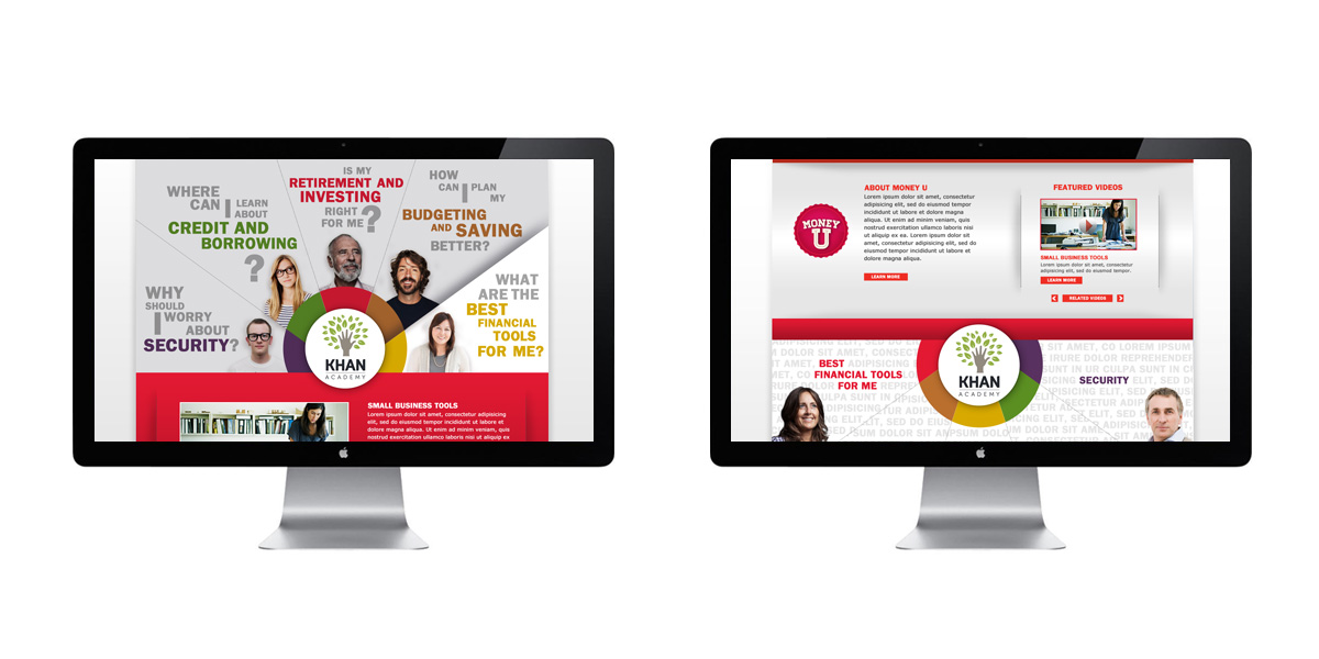
Let's face it, money is complicated. Bank of America tasked Digitas to come up with a way to educate Bank of America customers about everything from mortgages to saving for retirement.
The centered around a partnership with Kahn Academy to create a library of videos for anyone to access about all manner of financial topics. All in easy to understand non financial speak.
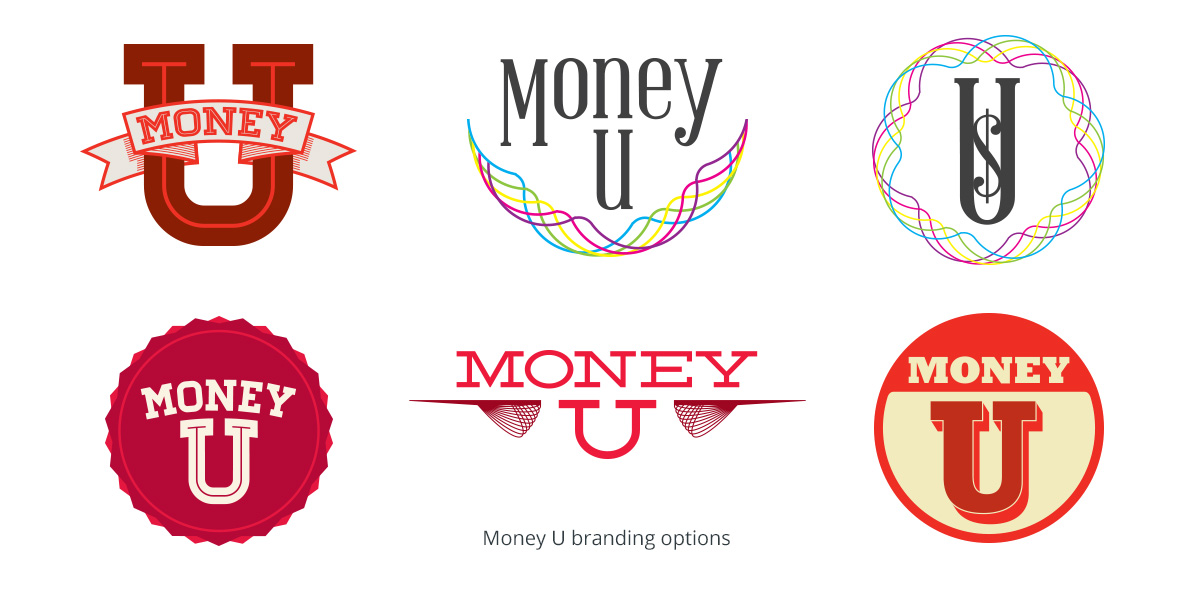
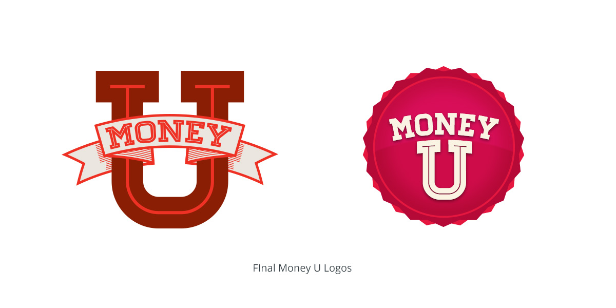
My role in this pitch started with branding the site named Money U. I created a number of logos which was paired down to two options which were given to the various art directors and designers on the team.
With the branding sorted out I set on building out concepts for what the hub could look like. We all focused on a single landing page to give the look and feel of the site. In the end Bank of America bought off on the idea which eventually evolved into Better Money habbits.
App download push
Key roles: Art direction and design
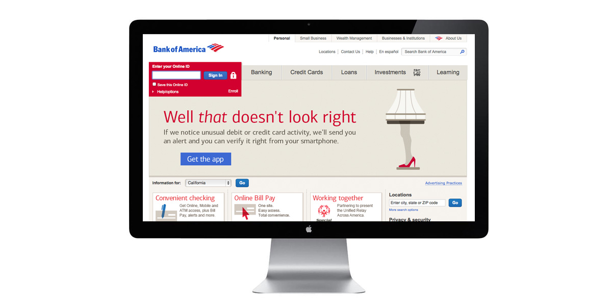
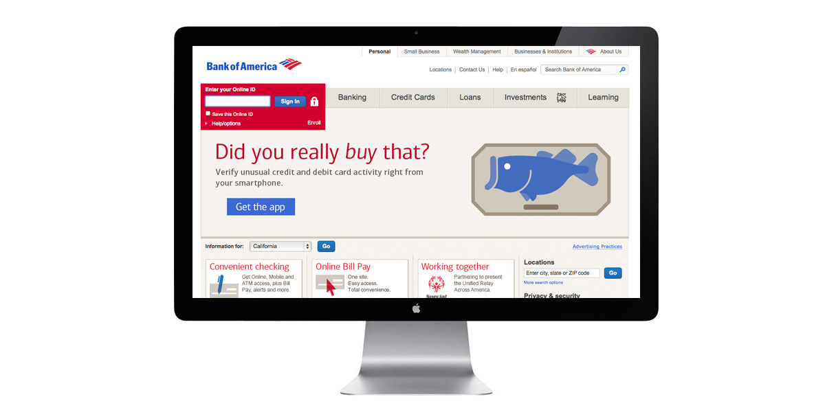
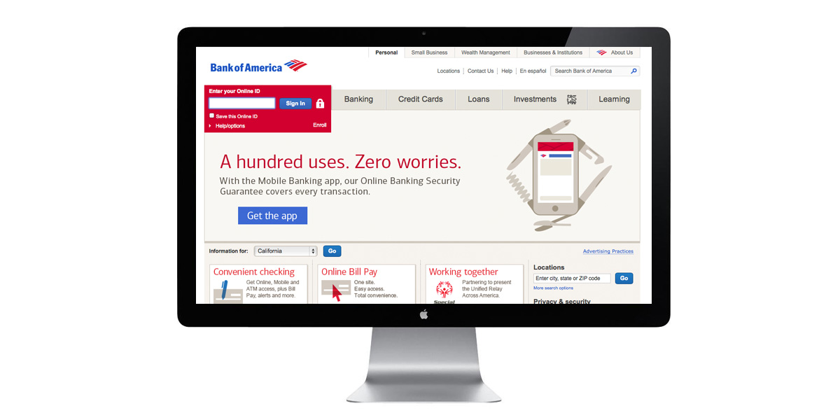
It's not glamorous but every site needs assets to keep the gears turning. But these assets came about from a big ask and took a surprising turn. Bank of America wanted to get 100% of their customers to download their app. That was a tall order, and after a lot of thought and research I realized that if Bank of America wanted to get to the last holdouts they were going to have to be a little out there.
Our plan was to work the security angle. We knew that these customers had not responded to all the other messaging of high tech and convenience. They had to hear something new and maybe a little shocking. We built a number of assets based around the idea of fraudulent purchases. From a talking bass to the gaudy leg lamp from a Christmas Story we asked visitors if they really bought that, following up with messaging surrounding the security and monitoring capabilities of the Bank of America app.
In the end it was a win for me to say I illustrated a high heel wearing, fishnet clad leg lamp. And it was featured in the most prominent real estate on Bank of Americas website. #winning!

Next project
MSK had an interesting problem: how do you build one site to speak to three very different audiences...and make nearly 16,000 pages easy to navigate? It was a big project but all for a great hospital.